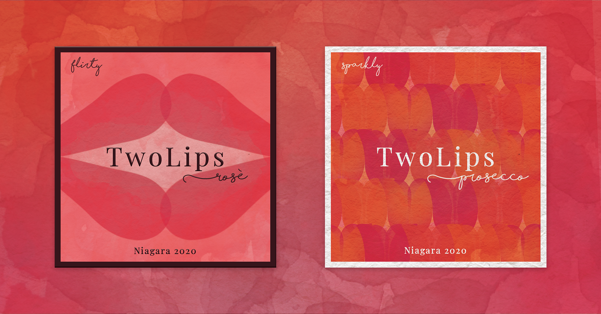
I’ve always been drawn to branding that uses symbolism, metaphors and wordplay, so this project explores how subtle visual cues can communicate personality and identity. The wine label TwoLips plays with semiotics through tulip imagery and a bit of cheeky wordplay. Tulips carry a soft, floral femininity, while the name hints at something more playful beneath the surface. The goal was to create something flirtatious and suggestive without being explicit, allowing the viewer to discover the layered meaning themselves.
The rosé label leans into intimacy and romance. Overlapping tulip petals form an abstract shape that can read as petals, lips, or bodies leaning toward each other. The soft palette and fluid textures reinforce a candlelit, date night atmosphere while keeping the tone elegant and slightly mischievous.
The Prosecco label shifts the mood toward celebration. Repeating tulips create rhythm and movement across the label, echoing the liveliness of sparkling wine. The shapes are more clearly illustrated but still maintain the subtle visual play that runs through the brand.
Together the labels build a cohesive identity that balances elegance with cheekiness, using floral symbolism and layered imagery to create something playful, suggestive and quietly flirtatious.
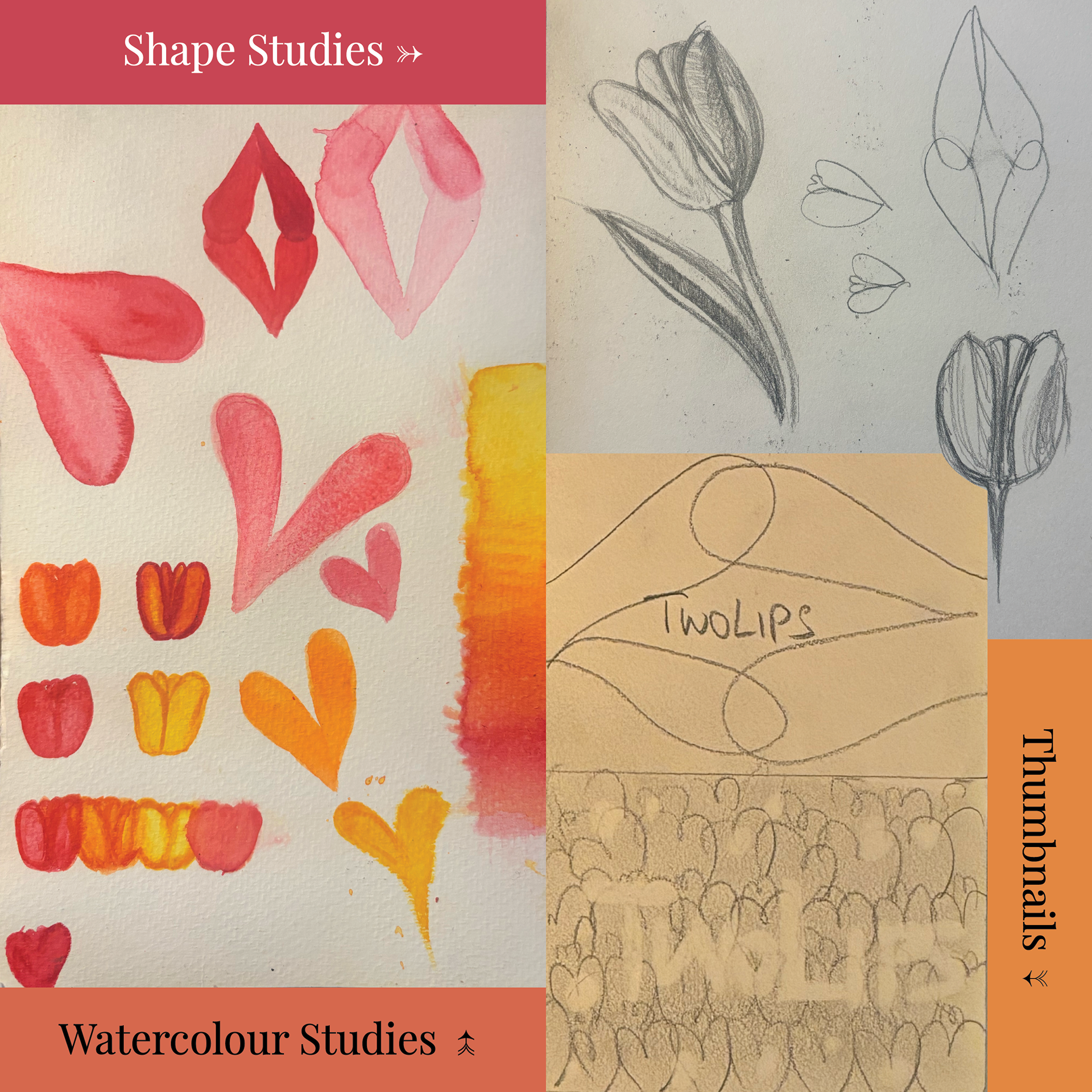
I began by exploring with watercolour, but eventually took it digital and used a set of watercolour brushes to recreate the experience on Adobe Illustrator, juxtaposing more solid, geometric shapes with wishy-washy watercolour. Then used Adobe Photoshop to transfer my design onto canvas paper, emboss the text and fix up the colours so everything was cohesive